The Spectrum of Influence
The Psychological Power of Color and How It Shapes Our Perception
How color shapes our emotions, influences our behaviors, and guides the choices we make—sometimes without our conscious awareness.
Color is so fascinating to me.
Perhaps I adore a hue that makes your skin crawl.
Maybe I love that color because it’s part of a core memory, while you have no emotion tied to it whatsoever. I can wear a certain color to channel a specific energy: to feel brave, appear trustworthy, or convey control, confidence. You might associate a color with me that I am completely unaware of— I hadn’t even realized it was a signature of mine. That’s the amusing beauty of color: it’s something we all see outwardly, yet when we look inward, it’s much more complex.
The idea that we could both look at the same sky and see different blues, only to be convinced in each other that we are both seeing the exact same shade is endlessly fascinating to me. I will never know for certain if the blue that I see is the one you see, too. The fact that we can’t describe a color without referencing another makes color feel more like a concept, something elusive we’re aware of, but can’t quite grasp.
If we’re each seeing unique fragments of the spectrum, unable to realize the difference between the ‘same’ color we’re all witnessing, how much else in life slips past our awareness? How will we know what we are unaware of? This little crack in our shared perception of reality keeps me up at night, scribbling and writing away.
Color defines us. It’s not just something we see; it’s something we feel.
It’s the unspoken language of our emotions. It showcases all of the things we feel, even if we choose not to say. According to the Color Emotion Guide (Kaya & Epps, 2004), every hue carries its own emotional charge. Therefore, by choosing to align yourself with a specific color, you’re doing more than selecting a favorite; you’re actively influencing how others perceive and respond to you. You’re controlling this part of your image.
Pavlov’s theory of associative learning clearly demonstrated that our brains instinctively link connected repeated stimuli to specific responses. This principle isn’t limited to conditioned tasks, it applies just as powerfully to color. When you repeatedly align yourself with certain colors, those hues begin to shape how others feel about you. The emotions and traits tied to the color become tied to you. Over time, even if the characteristics don’t perfectly match your personality, the connection becomes undeniable. The colors stop being something you wear— they become a core part of your identity.
Hue do you think you are? (forgive me, I couldn’t resist)
Red: Power, passion, and boldness—commanding attention and evoking confidence. On the color wheel, its the opposite of Green.
Curious Insight: Red can improve our attention to detail and memory recall. A study published in Science found that red enhances performance on tasks requiring precision and careful consideration, like proofreading. This is due to its association with danger, which triggers heightened awareness and attention.


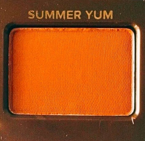
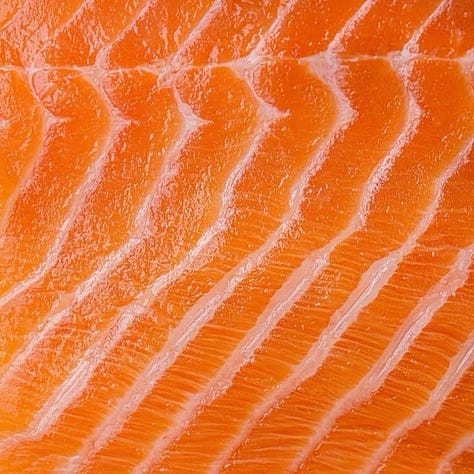
Orange: Energy, spontaneity, and playfulness—sparking creativity and warmth. Opposite of Indigo.
Curious Insight: A study in Appetite Journal found that orange environments can subtly influence people to make more impulsive food choices— it’s a highly motivating color. This extends to decision-making, where orange encourages quicker, less inhibited choices. It’s a color of immediacy and spontaneity.

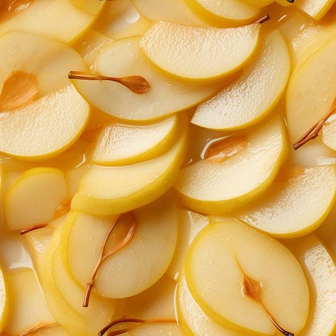
Yellow: Optimism, approachability, and cheer—projecting vibrancy and positivity. Opposite of Violet.
Curious Insight: Yellow can increase dopamine levels and spark feelings of competitiveness, not just happiness. Conversely, a study in Color Research and Application found that exposure to yellow enhances creativity and mental clarity, likely because it stimulates the release of dopamine and promotes optimism in problem-solving scenarios.


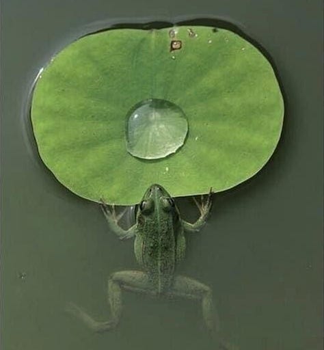
Green: Balance, renewal, and morality—symbolizing harmony and sustainability. Opposite of Red.
Curious Insight: A study by the University of Toronto found that individuals exposed to green before completing tasks made fewer unethical decisions than those exposed to other colors. The researchers concluded that green is psychologically linked to fairness and moral integrity.


Blue: Trust, calm, and dependability—communicating authority with ease. Opposite of Orange.
Curious Insight: Blue can slow down time perception. While known for calmness, it also influences how long tasks feel, making them seem less tedious. These findings indicate that blue's calming properties may extend to altering our temporal perceptions, making tasks seem less tedious when surrounded by blue hues.
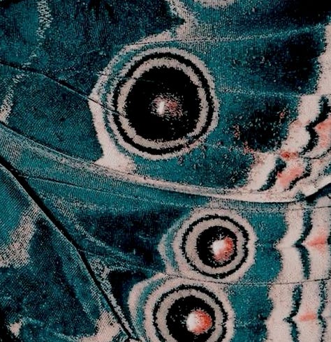


Indigo: Introspection, nostalgia, and mystique—evoking depth and emotional connection. Opposite of golden yellow or warm orange, depending on the level of violet.
Curious Insight: Indigo can deepen a sense of nostalgia and enhance emotional storytelling. It’s particularly effective in creating a sense of introspection or emotional depth. A study in Color and Emotion found that indigo hues stimulate areas of the brain associated with memory recall, particularly in autobiographical memories. This makes it a strong choice for creating a sense of personal connection or depth in visual settings.


Violet (Purple): Luxury, creativity, and ambition—suggesting sophistication and imagination. Opposite of Yellow.
Curious Insight: Purple can manipulate perceptions of time and luxury. In particular, violet tones are linked to an inflated sense of value and patience. A study in The Journal of Retailing found that stores with purple accent lighting influenced customers to spend more time browsing. The color subtly suggested exclusivity and sophistication, which heightened the desire to linger and explore.


Pretty cool, yeah? ;)
With great personal aesthetic,
Alexandra Diana, The A List
Additional Sources:
Kaya, N., & Epps, H. H. (2004). Color-Emotion Associations: Past Experience and Personal Preference.
Hemphill, M. (1996). A Note on Adults' Color–Emotion Associations.
Ou, L.-C., Luo, M. R., Woodcock, A., & Wright, A. (2004). A Study of Colour Emotion and Colour Preference.
Elliot, A. J., & Maier, M. A. (2012). Color-in-Context Theory.
Mahnke, F. H. (1996). Color, Environment, and Human Response.
"Psychology of the Color Red." Verywell Mind.
"Red: The Color of Power, Passion, and Populism." PRINT Magazine.
Color-Emotion Associations: Past Experience and Persdonal Preference


